Introducing Light Mode
Customize your Resend Dashboard experience with a light theme.
Today, we're thrilled to introduce something new - not just for you but also for us: Resend light mode.
While the dark color palette remains a staple of Resend's identity, the addition of light mode offers a different perspective to your experience.
Whether it's reducing eye strain during working sessions or enhancing visibility in various conditions, we believe in providing a flexible and inclusive experience for everyone.
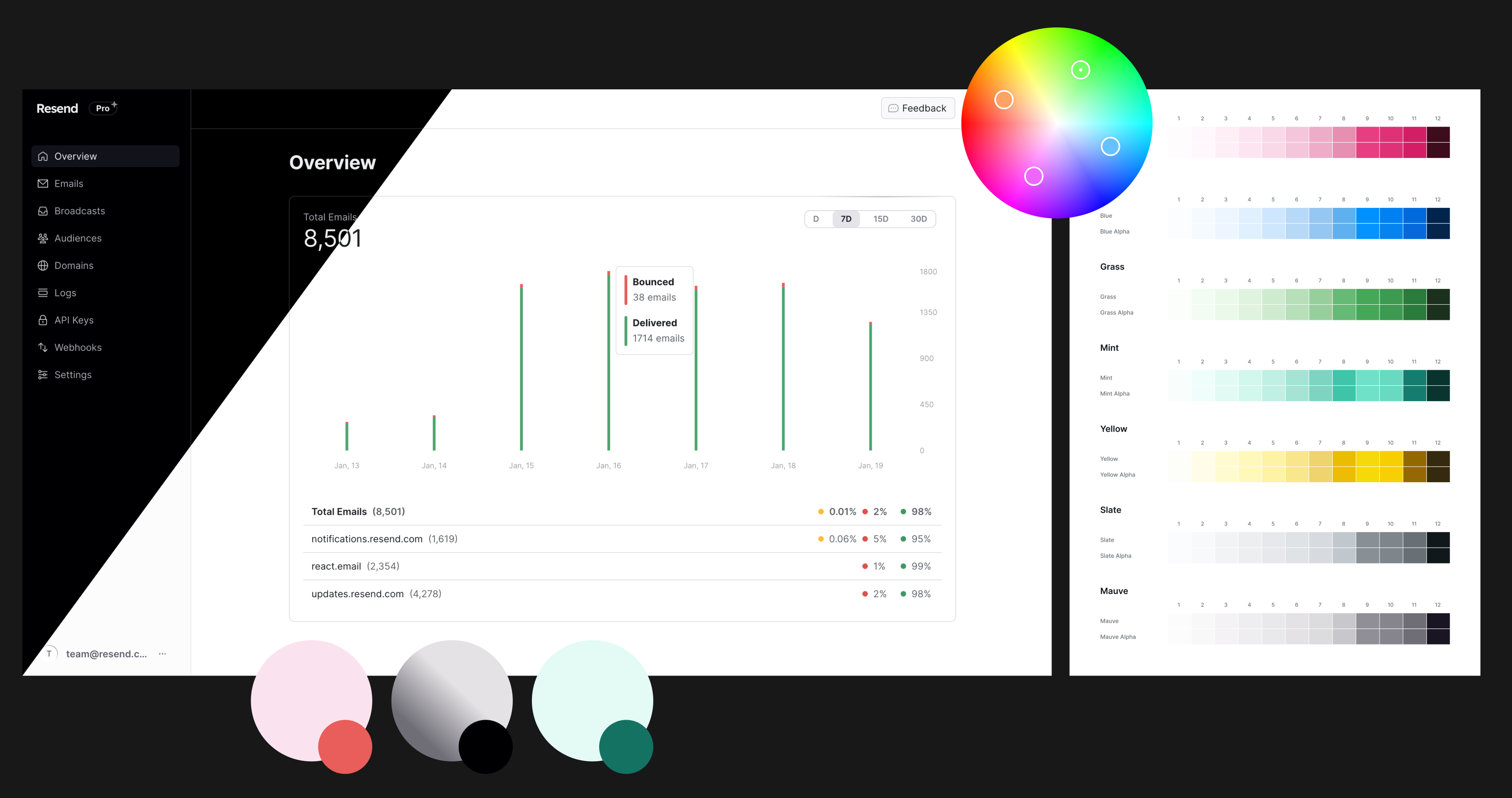
Powered by Radix Colors and Tailwind, we're excited to share how we implemented light mode into our product.
Why now?
As Resend expands to dozens of thousands of users, we heard feedback on dark mode being difficult for some to use.
Our goal is for people across your entire organization, not just technical users, to collaborate on emails using Resend. That's why we want to respect everyone's preferences.
How did we take our brand from dark to light mode?
Our brand identity hasn't changed; we still predominantly use dark colors in our communication assets. What we did was expand our dashboard to include light mode, primarily for accessibility purposes.
However, all marketing communications, landing pages, and public pages will continue to use our original, dark brand colors exclusively.
How did we implement this into our product?
This wasn't a one-to-one conversion from black to white. We began by conducting color experiments in Figma to understand what works and what doesn't.
When designing for a light background, many colors had their lightness and saturation adjusted to ensure legibility. We also had to consider the contrast ratio between the background and foreground colors.

The tech stack facilitated this transition a lot. By relying on Radix Colors and Tailwind, we accommodated approximately 70% of our needs by importing Radix colors as CSS variables and incorporating these values into our Tailwind configuration.
@import '@radix-ui/colors/slate-alpha.css';@import '@radix-ui/colors/slate-dark-alpha.css';
module.exports = {content: ['./src/**/*.{js,ts,jsx,tsx}'],theme: {extend: {colors: {slate: {1: 'var(--slate-a1)',2: 'var(--slate-a2)',3: 'var(--slate-a3)',...
For the animated icons powered by Lottie, we used a trick to invert the existing icons with the CSS rule filter:invert(1) to avoid generating new JSON files for each color.
We then started fine-tuning colors and other elements using Tailwind. For example, in light mode, the sidebar has a background color, but not in the dark mode. To achieve that, we used the dark: variant from Tailwind.
How about the documentation?
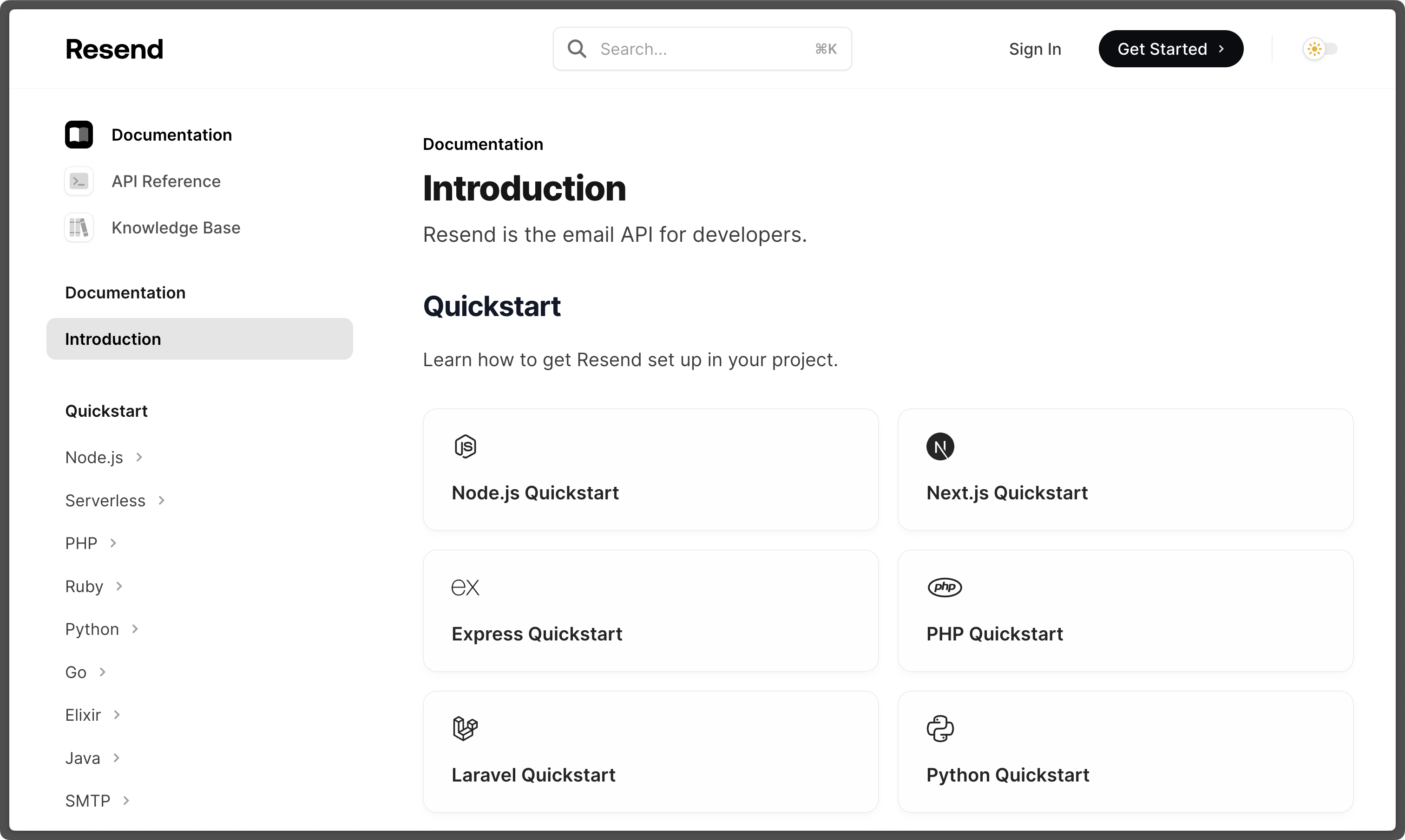
Thanks to Mintlify, we could implement light mode for our docs with a few lines of code.
You can find the new theme toggle on the top right corner of the documentation page.

Get Started
By default, dark mode is on, but now you have the option to switch the theme to light mode when it suits for you.
Visit the Resend Dashboard today and press M enable light mode.